
I feel like I’m missing something.
Don’t get me wrong. This is a stunning outing for Batwoman and I’m dying to know what the eff is going on. But I do feel like I walked into the middle of something. Like that common meme of the guy coming in with pizza and finding everything on fire.
That’s how this comic makes me feel.
It appears that Kate is in and institution. Having sort of snapped after her last confrontation with her sister.
Can’t blame her there. Really.
That would make most people crazy to confront their twin sister who is hellbent on doing something terrible to the world.
I mean, if Darkseid is involved, nothing good is coming of that. Nor from Anti-Matter. I mean, unless you’re in Star Trek. Apparently, they use that to fuel their ships. Which as a DC nerd, freaks me the eff out.
Anyway!
Kate’s therapist tries to help her.
Though Kate seems lost and confused.
Apparently, until the end when she is Batwoman daring people to try and come and get her.
Which – I would not.
I did not manage to read whatever brought Kate to Greece in past comics, so I’m not sure if there’s something I’m missing from that storyline. If anyone knows, please fill me in. A little synopsis if you will.
Regardless, I’m so curious to see more. Greg Rucka delivers a superb return to Kate Kane and the crazy dynamic between the two sisters. One they can never seem to escape.
I love it.
I especially love the line with Kate muttering in her room that one is dead, but the mirror lives on.
That is the line of the comic! If I wrote that – I’d have just let that sit for a minute. Like look at that! Will you? It’s amazing. Mic drop.
Amazing.
Rucka is without a doubt one of my favorite comic writers. Cannot wait to see what he has in store for us.
Also, I cannot sing his praises without singing Dani’s praises as well.
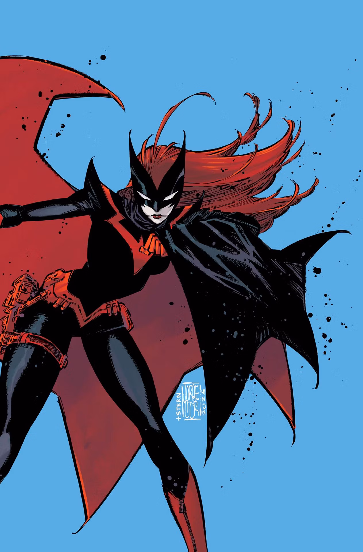
This is my favorite art style for Batwoman to date. I do not know, if she’s the reason for the font change for the title of the series, but whoever decided on it – needs a raise.
I despised the original Batwoman font on the covers. It just never… gave the right vibe.
This is way better.
Beyond that, I simply love the art style within the book itself. Every page is a stunning work of art as each character is given their own feel within the world. I really enjoy that Kate doesn’t look like a walking ghost in her regular appearance.
Seriously. If I saw someone who looked like her in real life – I’d be concerned about their health.
Alice is the appropriate of amount of haunted. Sunken, wide, crazy eyes.
Her crazed posture as Kate tries to bring her back.
Batwoman’s design where she almost appears to melt into the darkness around her. Never truly a solid shape in the dark of the memory.
I love that.
Love the image of them falling together.
The art style combined with the writing, allows me to sink my teeth into this series. I’m so excited to see what happens next.
I must also, commend Dani on one final thing. While reading the comics before, I often disliked little things about the art style. The font on the front. Kate Kane’s regular persona being far too pale and her tattoos appearing to be drawn on, rather than part of her being. Her form, here, as Batwoman is less concerned with depicting that she’s a woman and more about how she would present herself as the hero.
The little details that pulled me out of the comic just a bit. Little things that bugged me.
Because it didn’t feel like the artist was on the same page.
The art was stunning then. There were amazing things about it.
However, this suits Batwoman far more and I love that. Combing Rucka and Dani appears to be a recipe for success.
I – for one – am thrilled.
What about you guys? Drop me a comment and let me know what you thought of Batwoman’s latest outing?
Thanks for reading!
Spread the love and read on!


Leave a Reply